
Can Paint Change the Way a Room Feels?
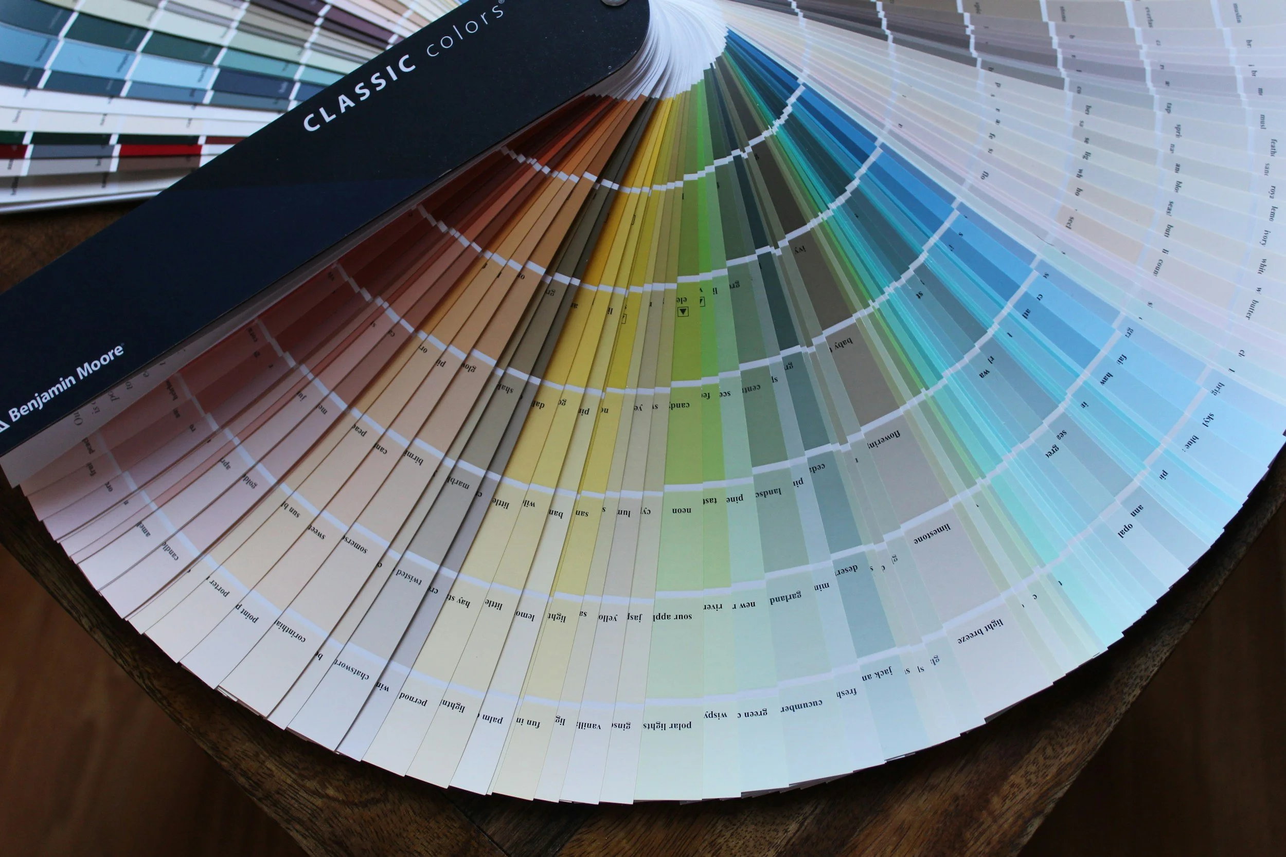
Most of us have had the experience of entering a room and immediately liking how it feels, even before we can explain why. The furniture and lighting play a part, of course, but color can influence the way we perceive a space too.
That’s the idea behind color psychology, which looks at the associations we make between color, mood, and behavior. Sherwin-Williams points to warm shades such as red, orange, and yellow as more energetic or stimulating, while blues and greens are generally associated with calmer, more restful environments.
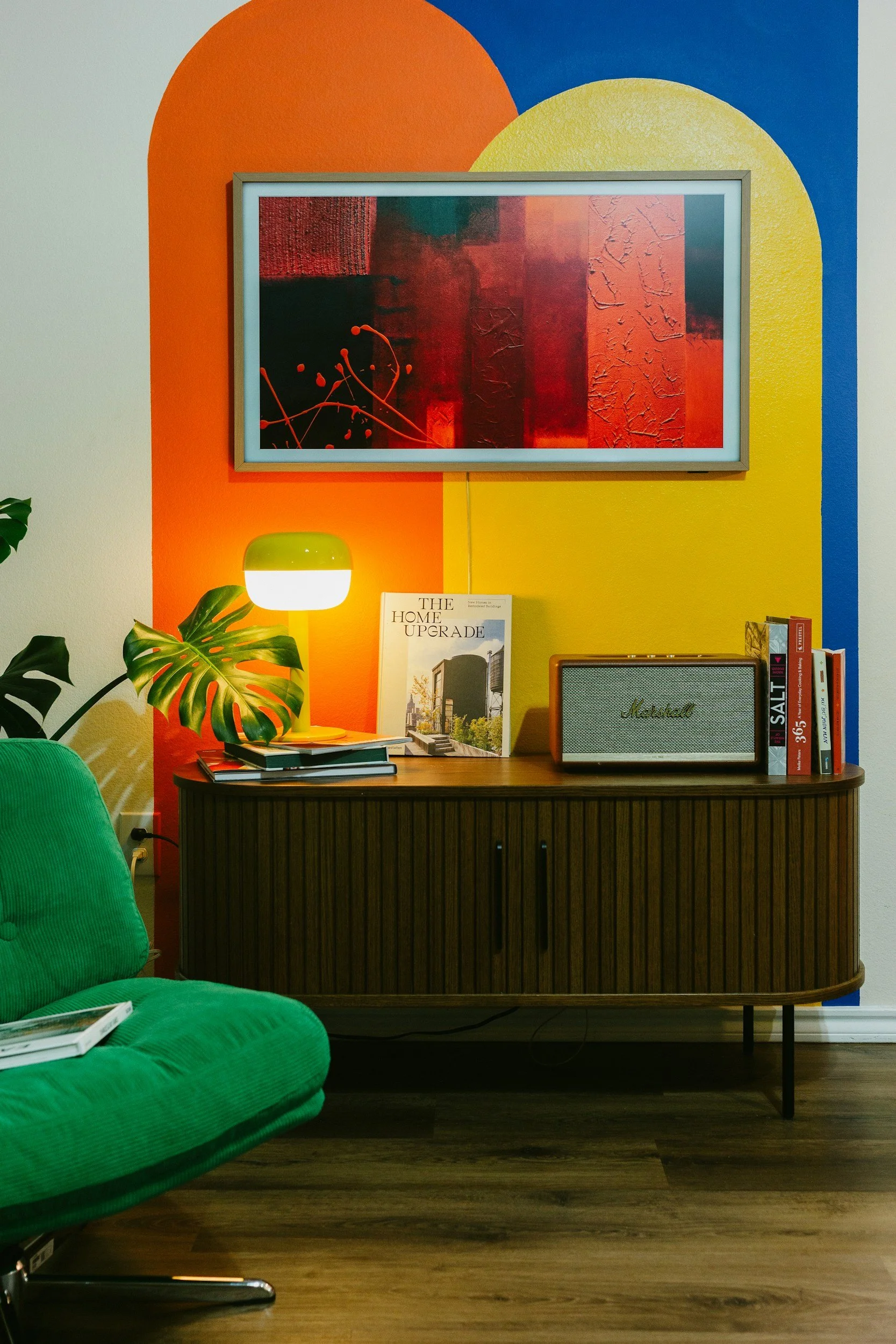
There is some science behind those associations, with an important caveat. A large 2025 review of 132 studies involving more than 42,000 people found remarkably consistent links between colors and emotions across different countries. Blue and green, for example, tended to be associated with positive, lower-arousal emotions, while yellow and orange were more often connected with positive, higher-energy feelings.
Why Green Is Having a Moment
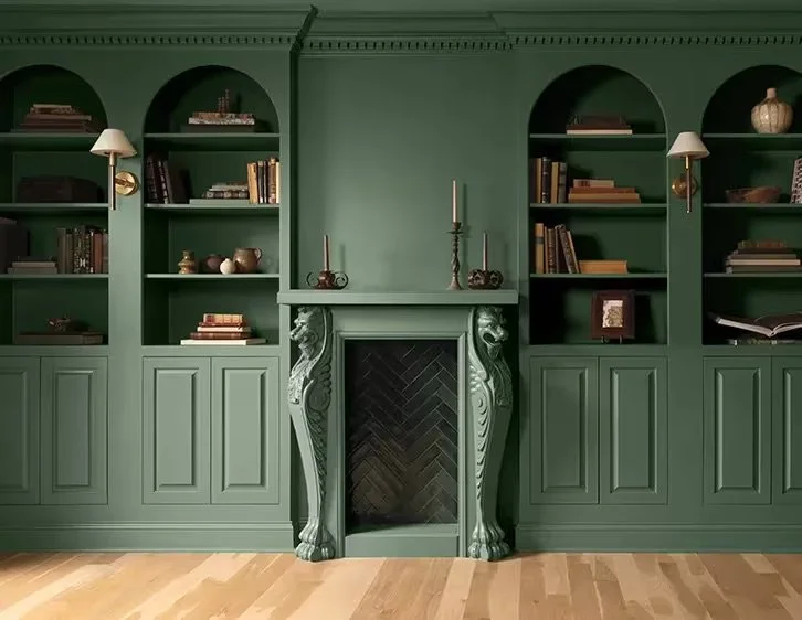
That makes Benjamin Moore’s 2027 Color of the Year, Webster Green HC-130, especially interesting. The company describes the mid-tone green as adaptable, composed, and timeless, and its 2027 palette leans toward warm, welcoming colors, softened neutrals, dusky pastels, and confident mid-tones.
We can see why green feels particularly appealing right now. It has enough presence to give a room personality, but it still has that visual connection to nature that makes it feel familiar.
Benjamin Moore is showing Webster Green on everything from full walls and built-ins to trim, doors, and exterior details, which also makes it approachable if you are not ready to commit to an entire green room.
Think About the Feeling Before the Color
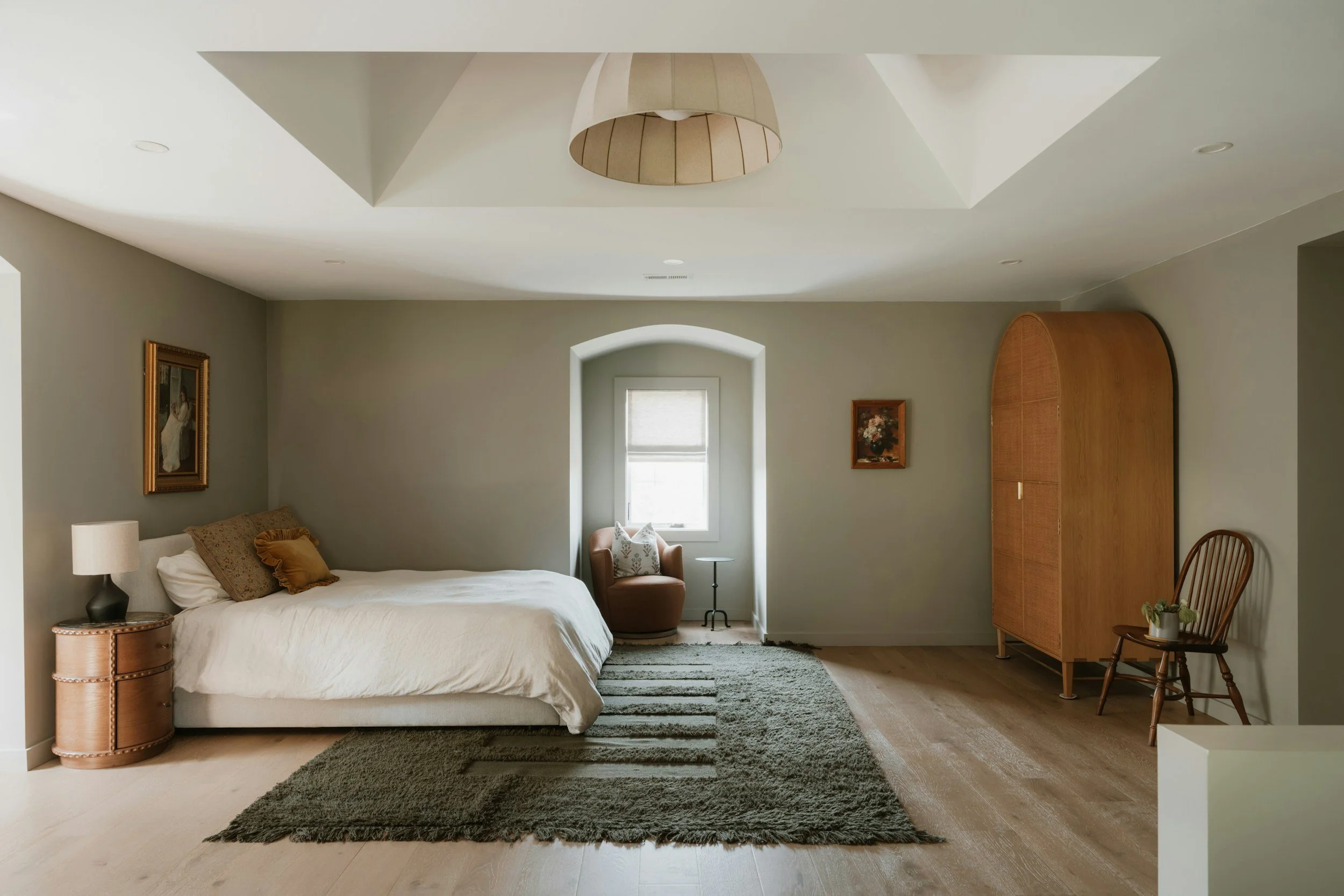
If you are considering painting, it may help to start with a different question than, “What color do I like?”
Ask yourself how you want to feel in that particular room.
A bedroom may call for something quieter. A home office might benefit from a color that feels fresh and focused. A family room may feel better with warmth and depth, especially during the months when we naturally spend more time indoors.
And remember that the exact shade matters. A pale green and a deep forest green can create completely different impressions, just as a soft butter yellow feels very different from a bright, saturated one. Lightness, saturation, surrounding finishes, and natural light all influence the final result.
Before committing, test samples on the actual walls and look at them at different times of day. Colors on a screen or paint chip can look very different once they are in your space.
And If You’re Thinking About Selling?
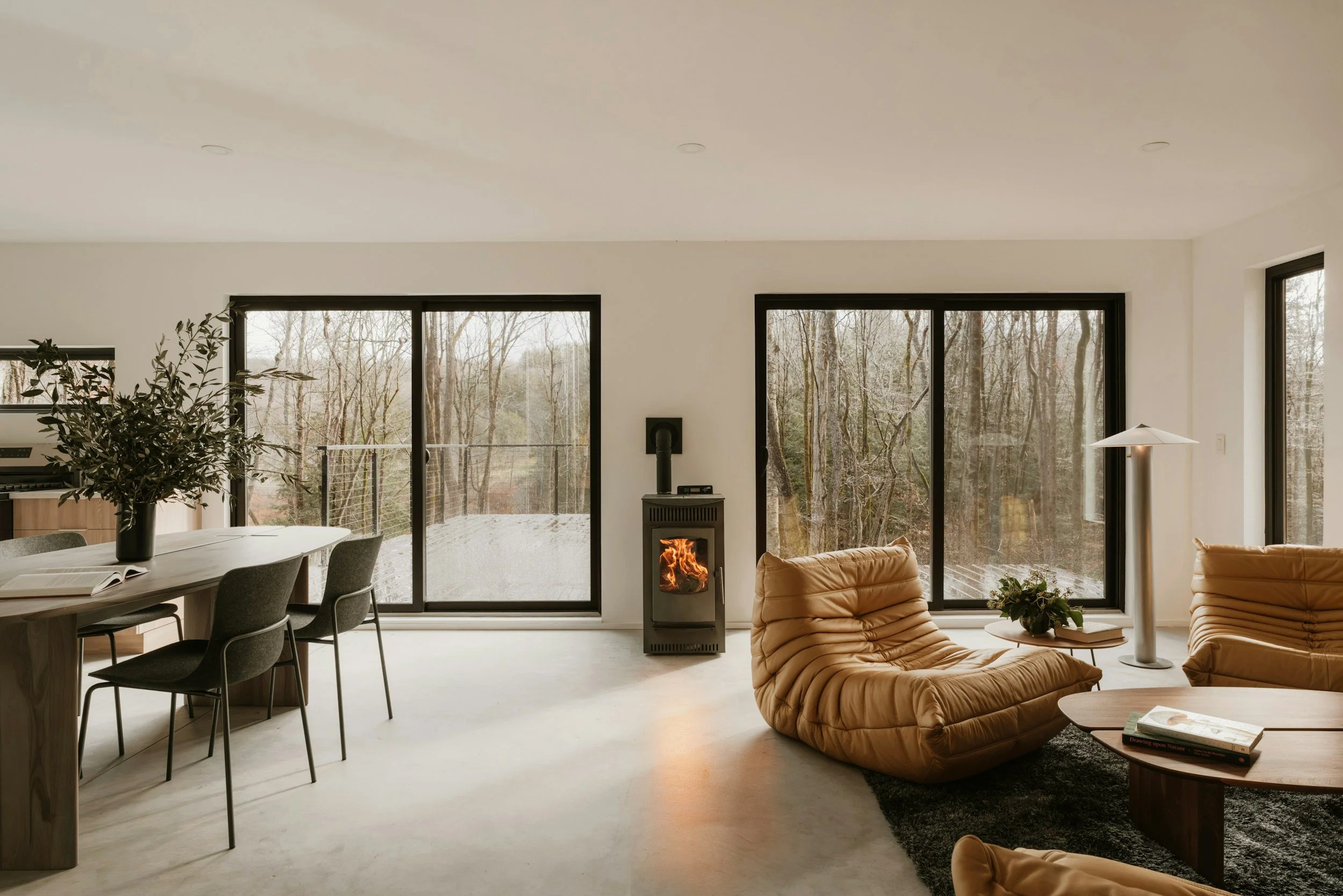
Color can also be part of the larger conversation about preparing a home for market. That doesn’t mean every house needs to be painted white before it goes on the market.
The goal is usually to help buyers understand the space without distracting them from it. Sometimes that means simplifying a very personal color choice. Other times, a beautiful green study, a warm dining room, or thoughtfully painted cabinetry may be part of what gives a home its character.
As with most decisions around a home, context matters.
Whether you are refreshing a room for yourself or thinking ahead to a future sale, we’re always happy to talk through which updates may be worth making and which ones you can simply enjoy as they are.
Sources
Sherwin-Williams — Color Psychology
Read the article
Benjamin Moore — Color Trends & Color of the Year 2027: Webster Green HC-130
Explore the 2027 Color of the Year
PubMed — 2025 systematic review of color-emotion associations across 132 studies
View the research
PubMed Central — Research on how color characteristics relate to emotional response
View the research